Edit with Grace: Art and Accessories that Breathe
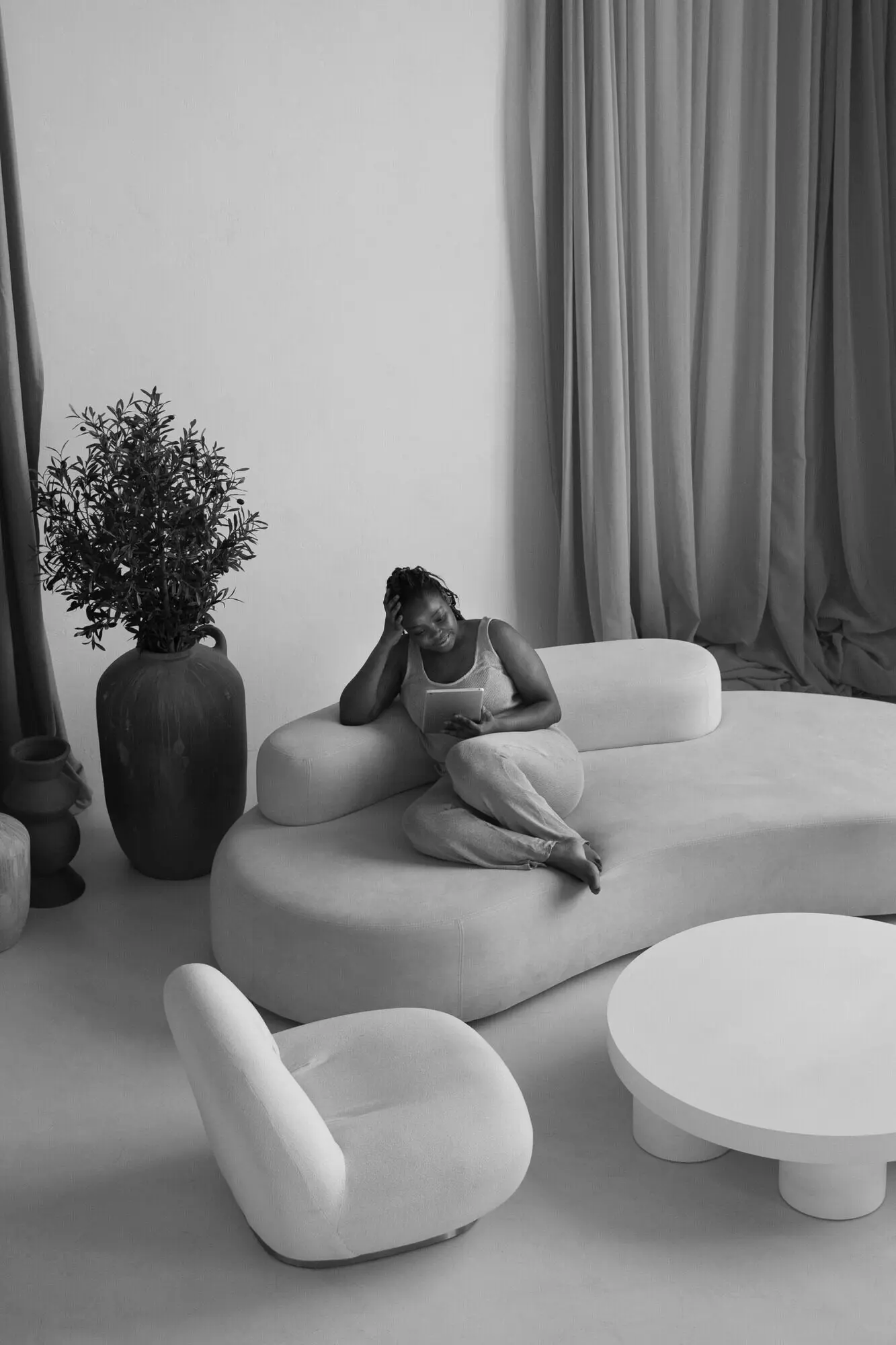
Today we explore Art and Accessory Editing: Achieving Restraint without Sterility—finding the delicate point where visual calm invites intimacy. Expect practical rules, candid stories, and gentle provocations that help you keep rooms soulful, not stark. Stay to the end for community prompts, thoughtful checklists, and ways to share your own experiments so we can refine together with curiosity, kindness, and courage.

Balance Over Bounty

Begin by weighing visual mass, not just counting objects. A single grounded sculpture can balance a cluster of smaller frames if heights and sightlines are thoughtfully staged. Aim for conversational distance between pieces, letting air and shadow participate. When in doubt, remove one item and observe whether the remaining forms speak more confidently and invite the eye to rest.

Repetition with a Pulse

Repeat materials and motifs to create rhythm, then introduce a controlled disruption so the room feels alive. Three linen textures and two matte ceramics might anchor calm, while one hand‑turned wood bowl adds heartbeat. Repetition binds a space; variation keeps it human. The goal is a coherent cadence that avoids sing‑song predictability and sterile sameness.

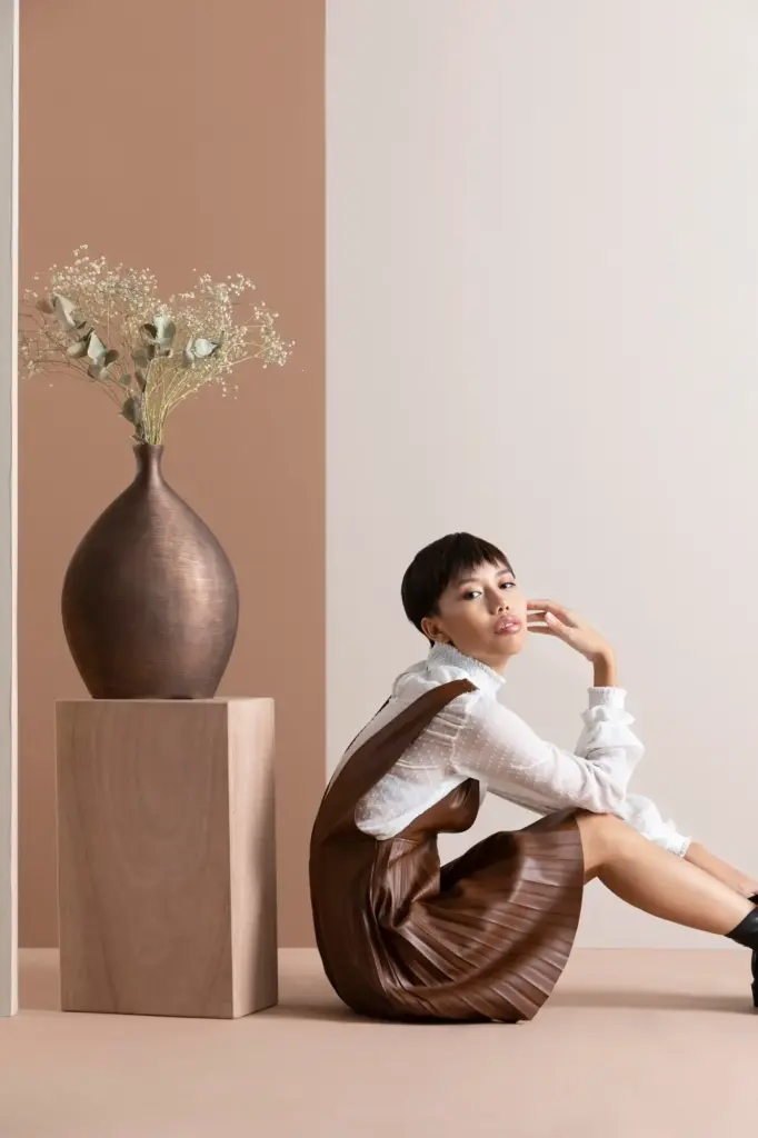
Human Traces, Honest Warmth

Embrace pieces that reveal use: a softened book spine, a slightly imperfect glaze, a woven throw with a repaired tassel. These small truths prevent minimality from feeling museum‑quiet. Let personal artifacts whisper, not shout. Curate what you love, then place it where hands can reach and eyes can meet it casually, so sentiment becomes atmosphere rather than clutter.

Palette, Texture, and Material Honesty

Color sets temperature; texture sets pulse. A restrained palette invites the senses to notice nuance, while honest materials add body without noise. By pairing chalky neutrals with earthy fibers and lived metals, rooms read calm yet dimensional. We will explore how tone, sheen, and grain collaborate to keep minimal choices comforting, tactile, and unmistakably human.

Neutrals with Nuance

Limit your palette but broaden its undertones. Warm grays, mushroom taupes, and bone whites layer gracefully when their temperatures harmonize. Test swatches at morning and evening; light changes everything. A quiet wall lets artworks sing, yet subtle color shifts keep the chorus interesting. When choosing frames and mats, echo those undertones to sustain depth without visual chatter.

Layered Tactility

Textiles and surfaces are your volume knob. Linen, bouclé, raw silk, and washed cotton invite touch, turning restraint into comfort. Pair smooth with rough: honed stone beside oiled oak, ceramic beside patinated leather. Texture is narration; it tells how a room is lived in. Use it to soften edges, catch light, and reward slow, curious glances.

Soft Metals, Quiet Shine

Reflective accents can cool or warm a scene. Brushed brass and aged bronze lend glow without glare, while blackened steel sharpens silhouettes. Keep finishes coordinated but not identical to avoid showroom stiffness. Small shifts—satin next to matte—add sophistication. Let shine be a hint, not a headline, so artwork and objects still read as the room’s essential voice.

Odd Numbers, Varied Heights

Trios and quintuples often feel natural because the eye triangulates. Combine tall, mid, and low heights to create a gentle slope that moves attention without frenzy. One vertical piece, a grounding horizontal, and a rhythmic in‑between often suffice. Leave a margin of air at edges, and you will discover that emptiness is not absence but eloquent punctuation.

Let Negative Space Speak

Whitespace is a material. On walls, it frames art; on shelves, it lets silhouettes breathe. Give every object a protective aura of emptiness, and you gain clarity, not coldness. Measure gaps like you measure frames: intentionally. When you step back, you should perceive pauses that relax your gaze and create a tempo you would happily live with daily.

Rotate with the Rhythm of Life

Seasonal rotation prevents both clutter and sterility. Store a small archive and bring pieces forward with shifting light, holidays, or moods. Each re‑curation renews attention and gratitude. The practice keeps meaning fresh without constant purchasing. Treat your shelves like a gallery on a long, gentle timeline where memories occasionally take the stage and then graciously rest.

Placement, Scale, and Sightlines

Where and how you position art and objects determines whether restraint feels thoughtful or severe. Scale relationships, alignment, and eye‑level decisions create calm pathways for attention. We will map sightlines from entrances and seating, ensuring first impressions are composed, and secondary glances reveal gentle surprises that excite curiosity without overwhelming the senses.

Light, Shadow, and the Lived-In Glow

Lighting decides whether restraint reads cozy or clinical. Layer ambient, task, and accent sources with warm color temperatures to flatter textures and skin. Embrace shadow as a collaborator that sculpts form and mood. With dimmers, translucent shades, and reflective surfaces, you can tune atmosphere from morning clarity to evening hush without sacrificing clarity or comfort.

Stories, Lessons, and Gentle Invitations

Real rooms teach best. Here are quick, honest narratives showing restraint gaining warmth without sliding into clutter. As you read, consider your own experiments and share photos or reflections. Comment with questions, subscribe for monthly edits, and join our ongoing exchange where curiosity, humility, and generosity make beautiful spaces feel personal and alive.
Ponalapinekalozotuna
Privacy Overview

This website uses cookies so that we can provide you with the best user experience possible. Cookie information is stored in your browser and performs functions such as recognising you when you return to our website and helping our team to understand which sections of the website you find most interesting and useful.